AutoGravity
AutoGravity
AutoGravity
AutoGravity

AutoGravity
AutoGravity
AutoGravity is a financial technology startup that partners with the world’s leading banks, financial services companies, and dealerships to give you direct control over how you purchase and finance your car.
AutoGravity is a financial technology startup that partners with the world’s leading banks, financial services companies, and dealerships to give you direct control over how you purchase and finance your car.
Year: 2018
Year: 2018
Year: 2018

Logo animation I created in After Effects
Overview
Overview
AutoGravity provides a service that allows people to find a vehicle they’re looking for. Whether the vehicle is new or used, consumers can apply for financing and get up to four financial offers from our partner lenders. Some challenges I faced when working on this project is the amount of lenders that are in the network, quality of applicants who are using the product, and legal concerns around the image and video assets needed to power each brand page.
The company was in the process of transitioning from being a lender platform to an all-in-one service that provided end-to-end browsing for their shopping experience. This meant the user experience had to adapt to change to AutoGravity’s new mission.
I partnered with our user experience designer to conduct qualitative and quantitative research through focus groups, A/B testing, and surveys sent out to random group of participants.
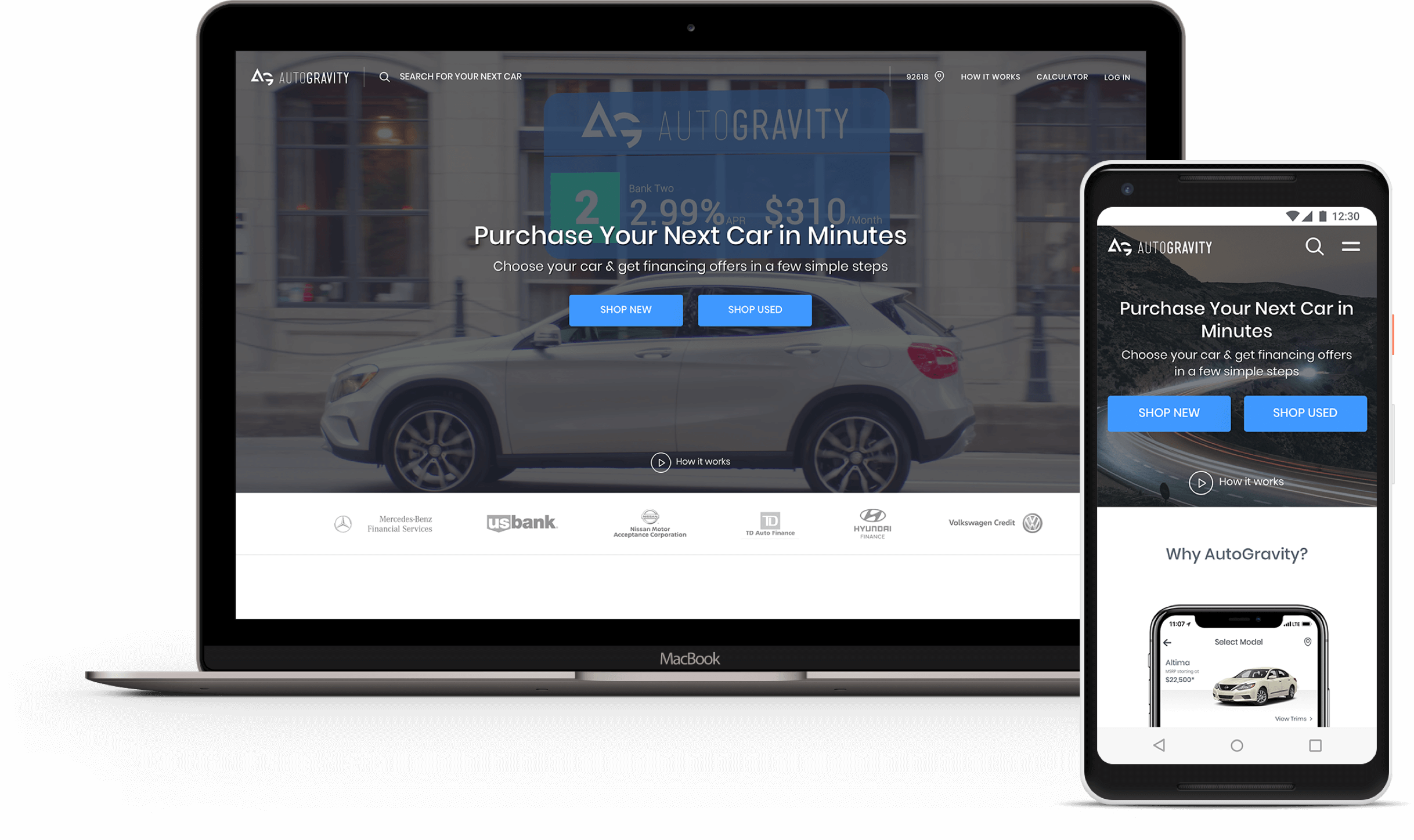
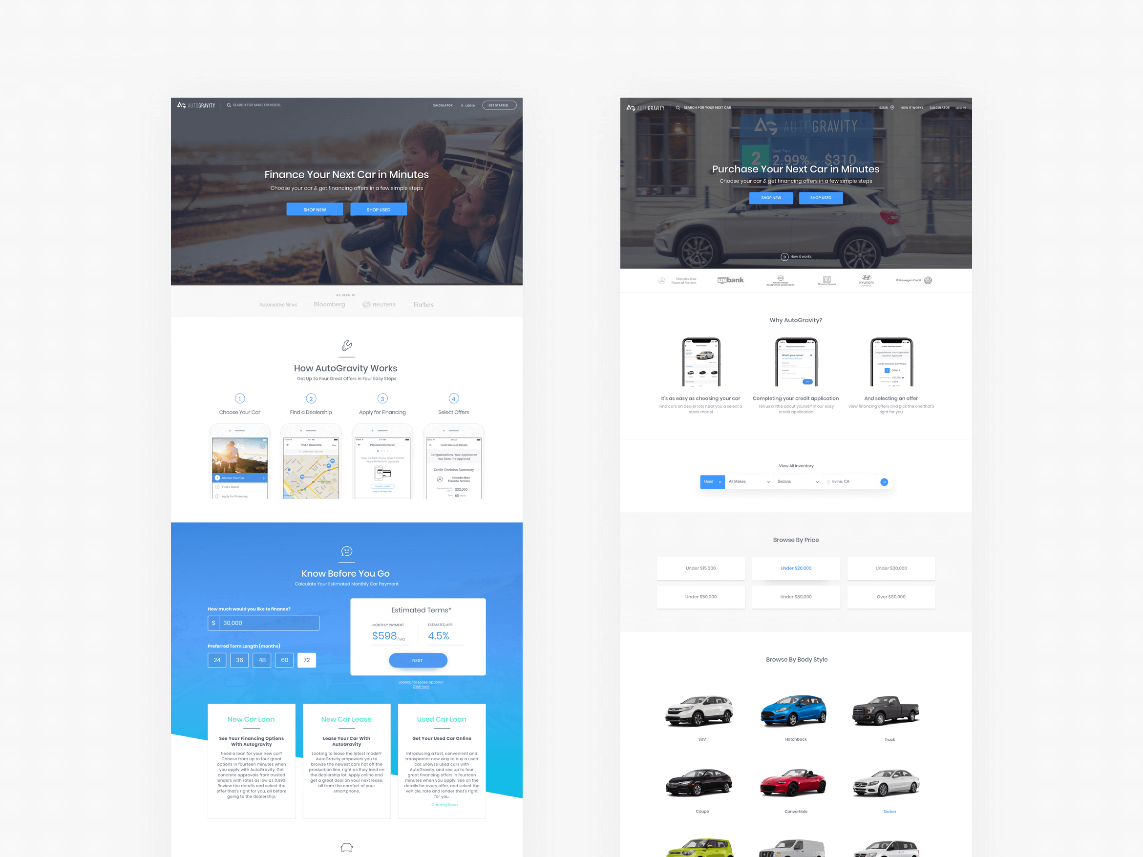
Bringing the car buying experience back to earth
Bringing the car buying experience back to earth
During our single day focus group study held with 24 participants, we uncovered some methods people used to find the vehicle they were looking for. These methods were browsing by brand, body style, price, condition, and lifestyle.
Other important things we noticed were that no really knew who AutoGravity was and what the company offered. This informed us of our customers’ pain points and things we should address.
Based on the findings from the focus group, I introduced three components: a dynamic hero that would link to an explainer video, a trust bar that lived above the fold to showcase our credit lender partners, and a How it Works section for new users to understand right away what the product offerings were.
Shop New and Shop Used buttons were added in the header as the primary call to action, and a modular approach was taken to introduce other entry points of shopping.
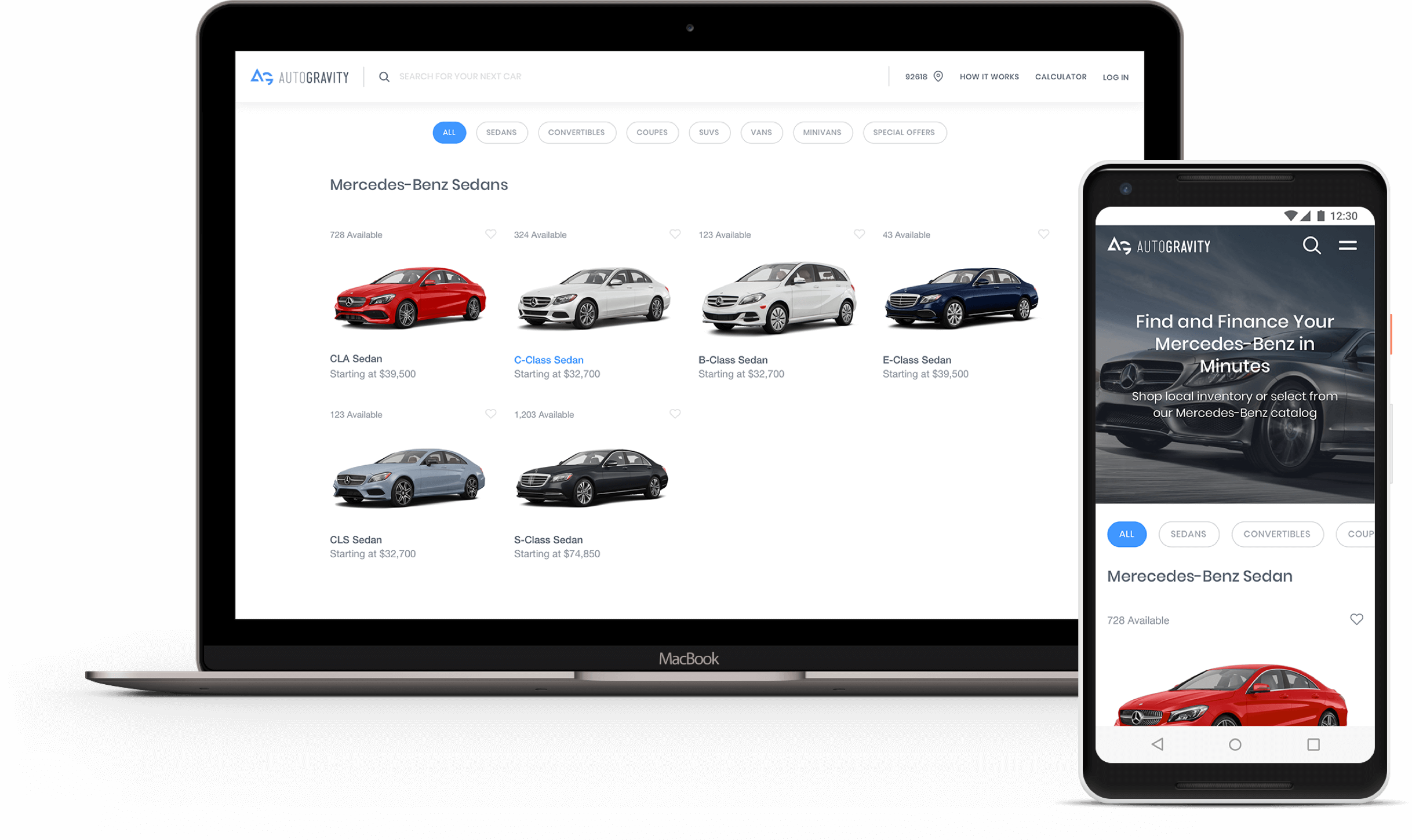
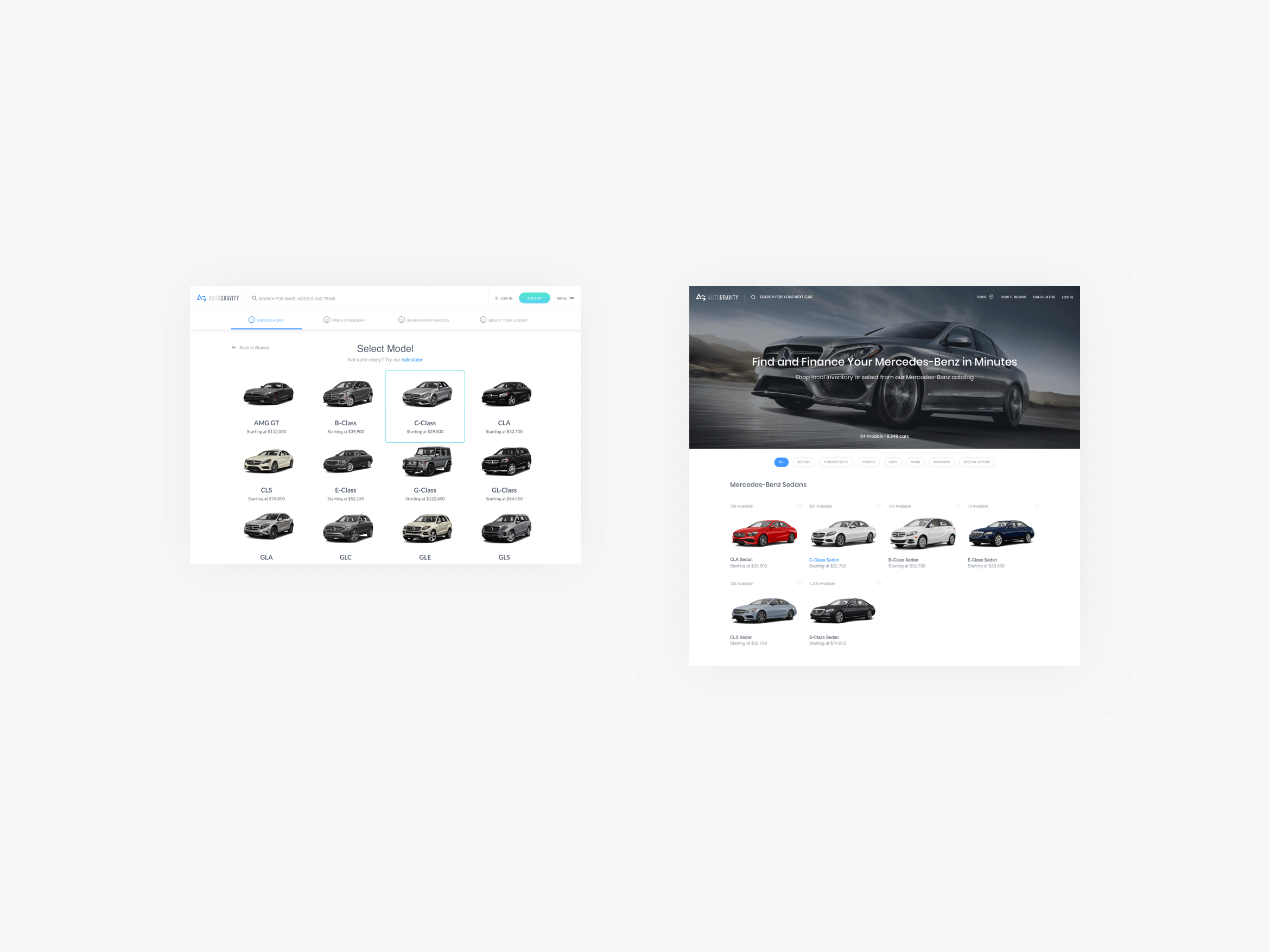
Brand Recognition
Brand Recognition
The current Make landing page was sterile and lacking any semblance of the brand a person was viewing. These brands spend millions of dollars a year to perfect their advertising, therefore, it only made sense to leverage what they already had to showcase their vehicles in the best possible way.
I introduced a hero image featuring key visuals of flagship models for any particular brand. This approach could be replicated and scaled for all brands. This helped inject life into what were once bland pages.
A small introduction of filters on this page helped prospective buyers shop by body styles within a brand landing page.
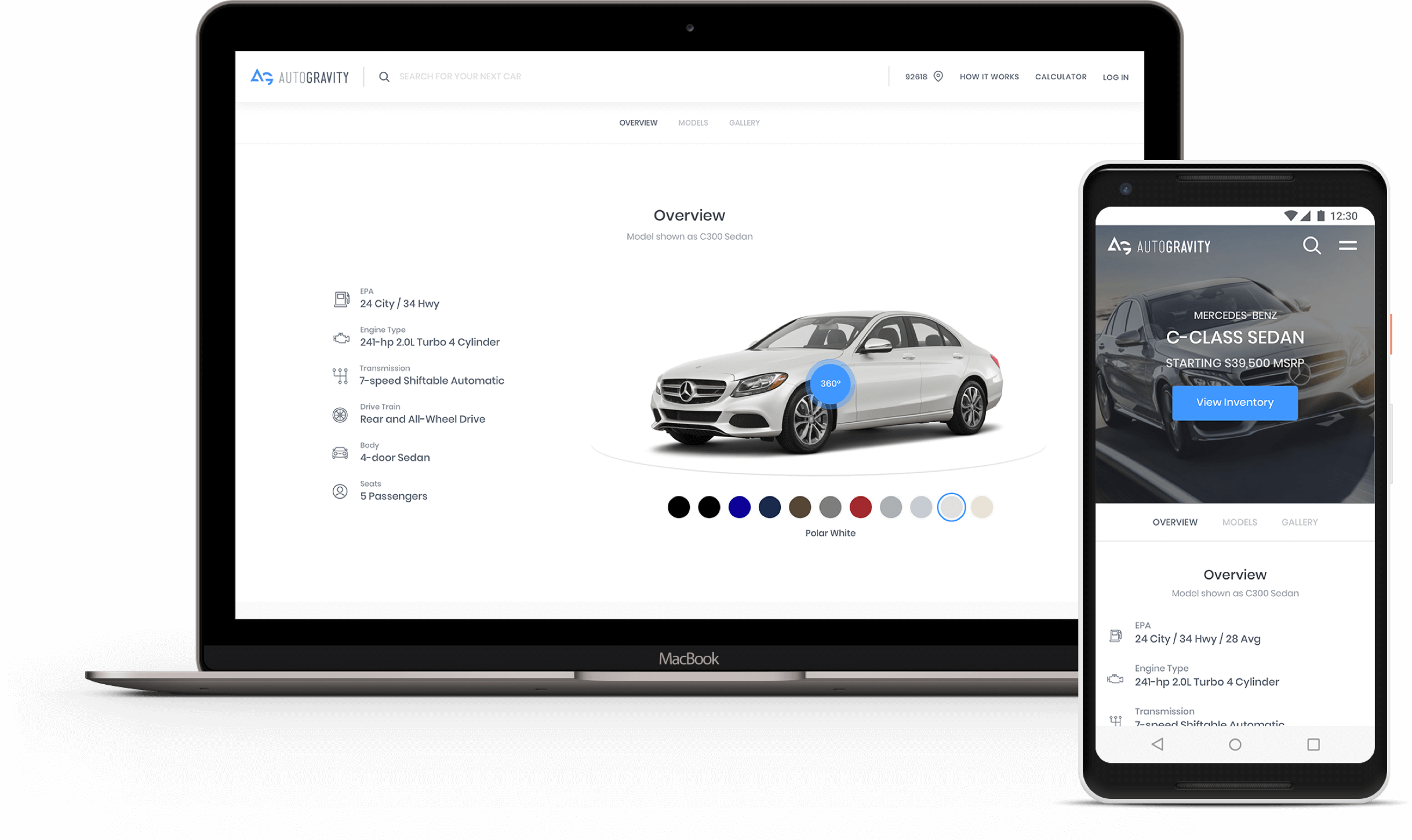
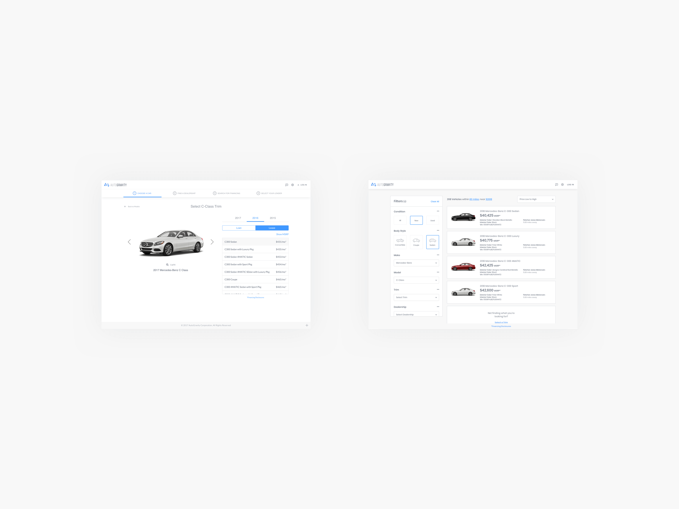
Possibilities
Possibilities
The Model landing page didn’t exist before, and this was something I wanted to introduce to help separate the browsing from the shopping experience. From the research our team conducted, we found that there were multiple ways people were searching for a vehicle they were interested in. They used dealership websites, third party resources for reviews, and YouTube to hear what credible channels thought.
Because we wanted to be an end-to-end experience, it made sense for us to add a landing page that highlighted key features, color options, vehicle options, and related or similar vehicles. As a result, prospective buyers could quickly learn and compare their favorite models against each other. A caveat with this page was that a different strategy would have to be implemented for a new or used vehicle.
Finding the right vehicle for you
Finding the right vehicle for you
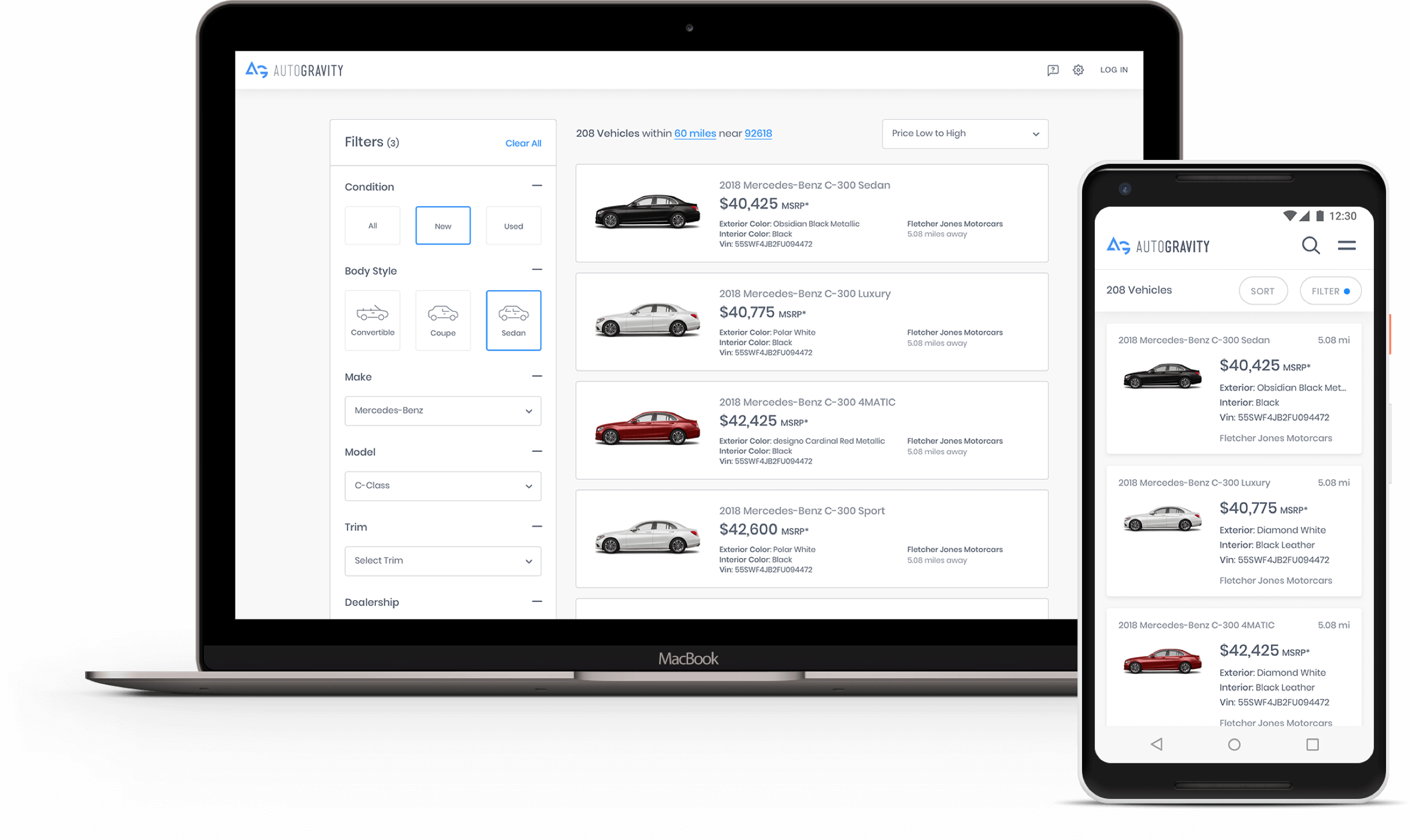
The previous “Inventory” experience displayed a list of trims that weren’t named properly for an average consumer to understand. Furthermore, it also showed varying prices without explaining why. This made it difficult for consumers to find the right vehicle. Were the variations in price due to certain colors, packages, or other options?
The experience I designed provided additional context by displaying the photo, consumer friendly names, mileage if it was a used vehicle, and the dealership where the vehicle is located.
Filters were also introduced to allow a person to narrow their search by a variety of options such as color, body style, condition, and price.
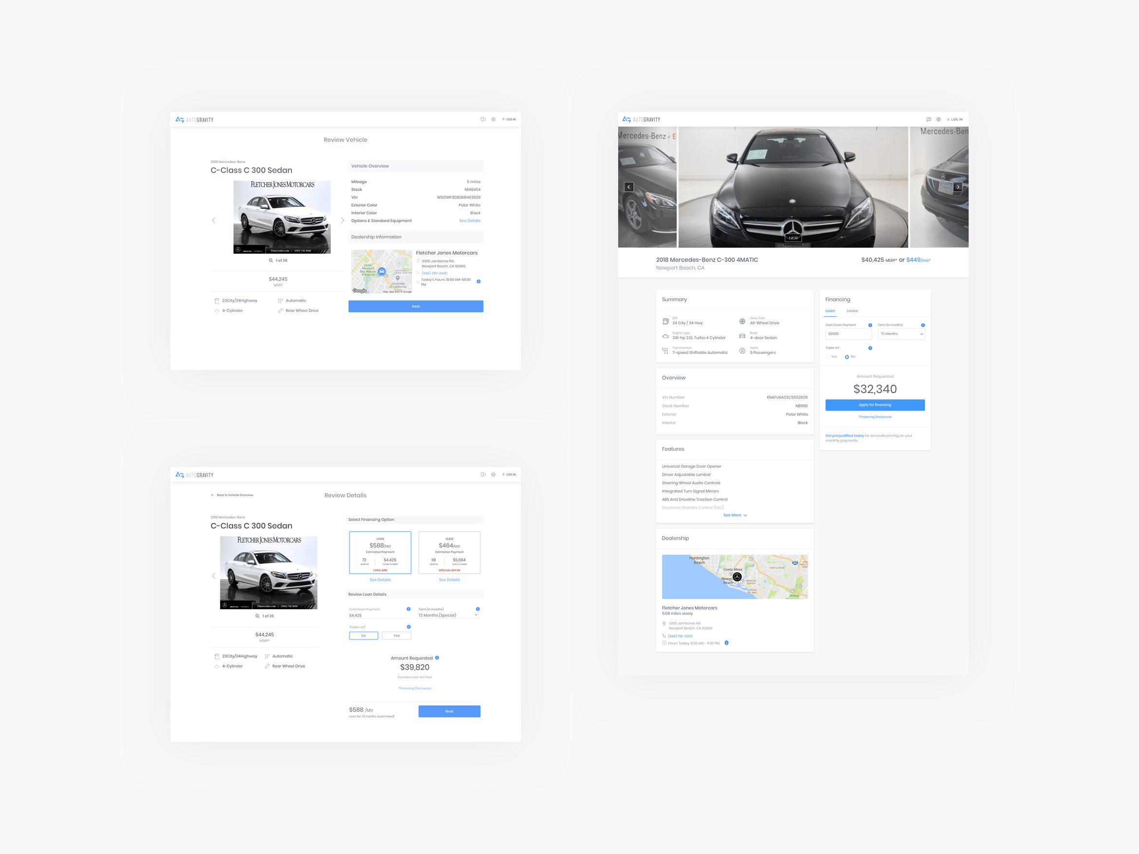
Building confidence
Building confidence
Building Confidence
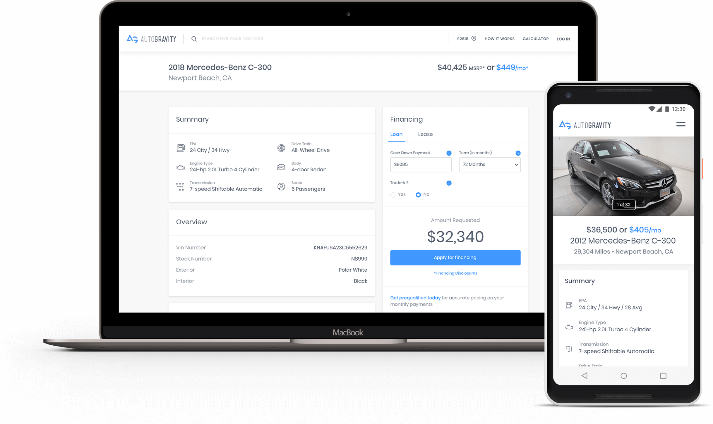
The previous “Vehicle Overview” page was broken into two parts: vehicle overview and financial details. Because the financial details were a separate step, I hypothesized that this took the consumer’s attention away from viewing the vehicle. Thus, leading to a lower conversion rate on this page.
Data from our analytics tool used to track our funnel supported my hypothesis. I created some new designs that combined the vehicle and financial details into one page. This highlighted the unique specifications and features in a meaningful way, and added a CarFax integration to provide additional details. I partnered with our user experience designer to run some preference tests, and the results came back overwhelmingly in favor of the new proposed design.
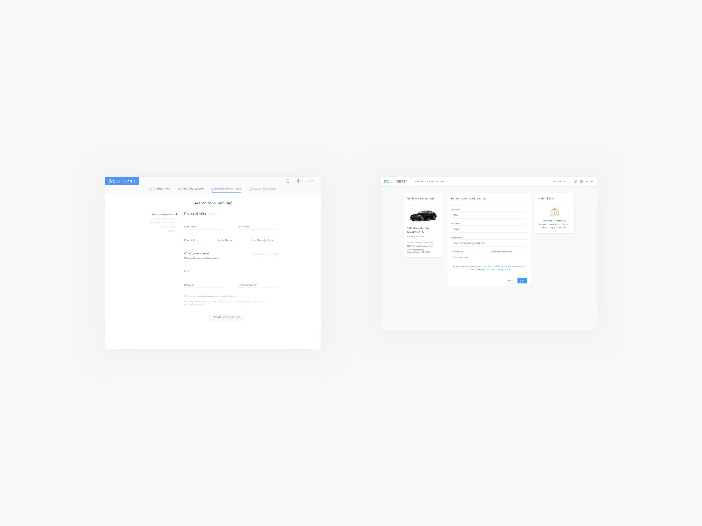
Simplifying the process
Simplifying the process
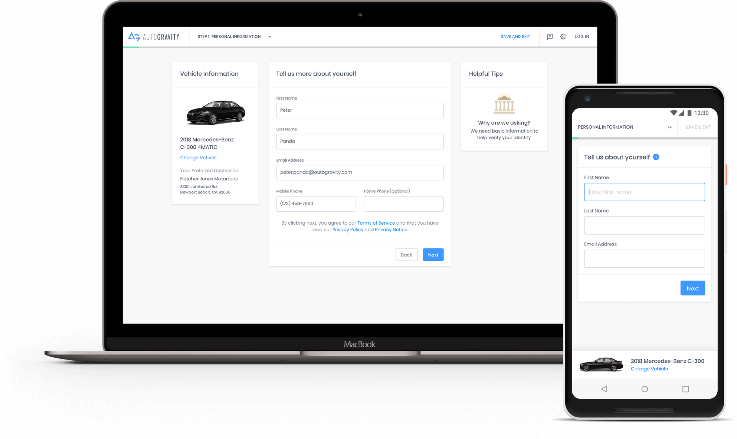
I noticed some limitations with the current implementation of the credit application. We didn’t show the applicant the vehicle they were applying for, and we didn’t allow them to save and continue at a later time. This was a clear problem when an applicant would start a credit application but not have the required documents on hand to complete. Consequently, this caused them to lose all progress, and they would have to restart the entire application again.
An interesting discovery noted from our research was that people didn’t feel secure inputting sensitive information on the mobile applications and were more inclined to apply for financing on the desktop experience. In fact, our analytics data saw that desktop had a higher conversion rate than our mobile apps.
To create a better experience on the credit applications, I introduced some improvements. First, I included a helpful tips section to explain why we’re asking for sensitive information. Secondly, by grouping related questions into themed sections, this made the extensive application feel more digestible. Finally, I showed the vehicle the person was applying for as they were filling out the application.
Reflection
Reflection
One of the biggest challenges faced was getting the proper assets to build out a visual catalog. We didn’t have access to the collection of photos, videos, and information needed to properly build out the vehicles’ pages. After several discussions, an idea spurred that during contractual conversations, any lender who wanted to be on the platform would give us access to their media libraries. This was a huge win in making this new vision come to life. From this turning point, I learned that legal could be involved in the design process just as much as any other department.
One of the biggest challenges faced was getting the proper assets to build out a visual catalog. We didn’t have access to the collection of photos, videos, and information needed to properly build out the vehicles’ pages. After several discussions, an idea spurred that during contractual conversations, any lender who wanted to be on the platform would give us access to their media libraries. This was a huge win in making this new vision come to life. From this turning point, I learned that legal could be involved in the design process just as much as any other department.
Collection of before(left) and after(right) designs